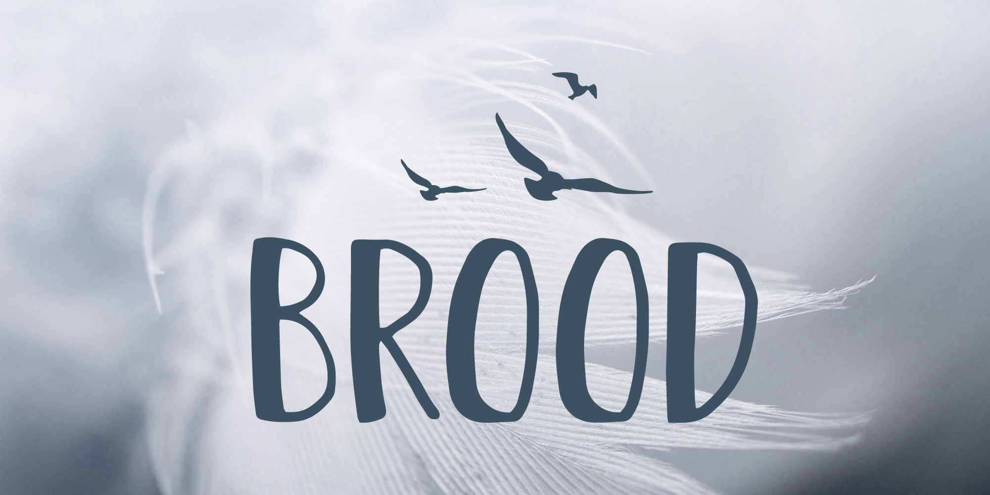
We met with Brood back in early August to discuss the rebrand and relaunch of their business ‘Brood’.
Natalie from Brood created a great mood board for us before we began and a pinterest board with logos they liked the look of. This gave us a really good starting point to establish the style they were after for the Brood branding.
It was really exciting to be given such a creative brief
It was clear from the moodboards that they were looking for a hand drawn, natural feel to the logo, nothing too modern or corporate. They wanted to incorporate feathers, birds, leaves and flowers… but nothing animated or girly. Hannah was going to need to draw lots of inspiration from the Worcestershire countryside on this one!
Stage 1
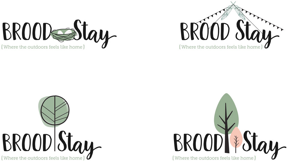
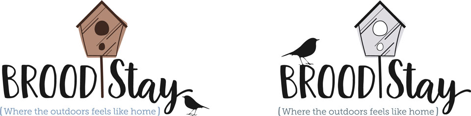
We began with the ‘Brood Stay’ sub-brand logo initially, this way we could focus on one brand and supply a broad range of ideas in the initial stage, to find the style, then apply that to the other brands.
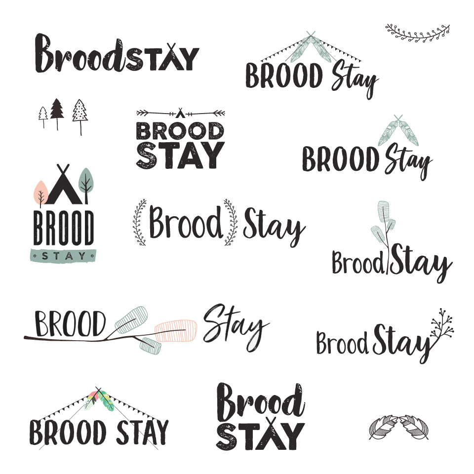
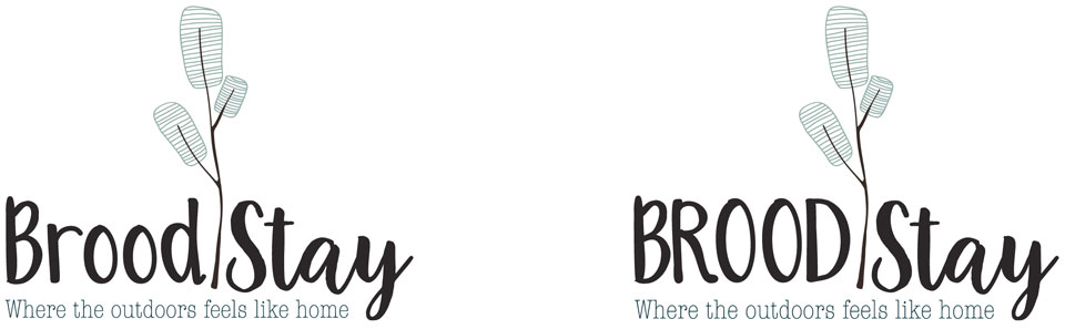
From the first draft, they chose the following logo to develop. We decided to take the ‘BROOD’ font from the left logo and the ‘Stay’ font from the right logo. The two fonts compliment each other nicely as they have similar weights to them, but the mixture of hand drawn and script, differentiates the two words in the logo.
Stage 2
For the second stage of the project, we brought all 4 sub-brands into action. Working on icons for each area of the business, we tried to give a variety to choose from but all in a similar style so they could mix and match them.
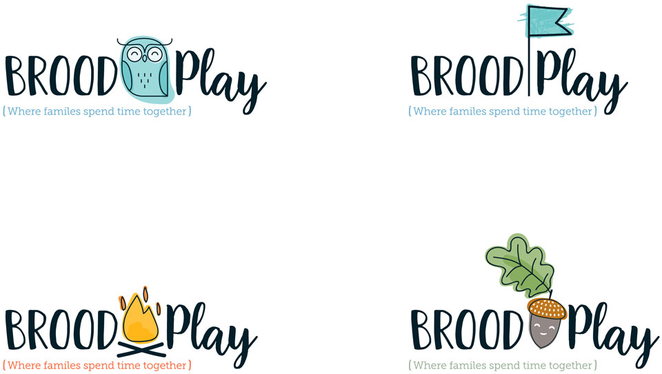
The ‘Brood Play’ logo is a little more child friendly than the other logos but still designed within the same style.
Stage 3
The second stage went really well and several of the icons have barely changed since!
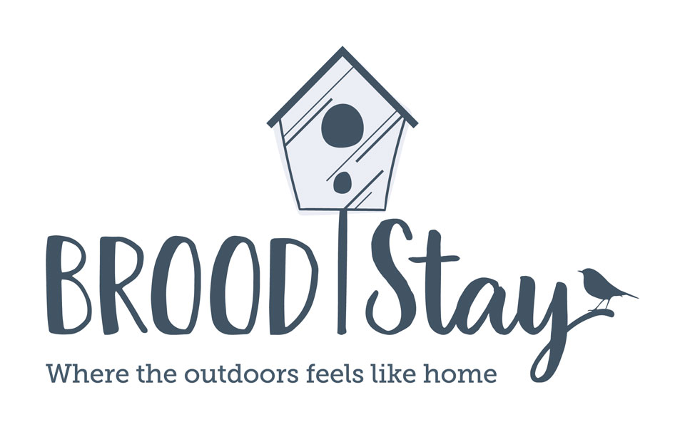
Brood Stay
We took the birdhouse which we designed for ‘Brood Home’ and made it the icon for ‘Brood Stay’.
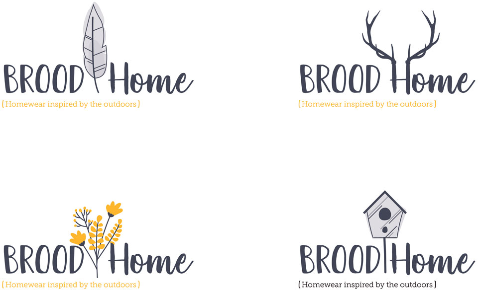
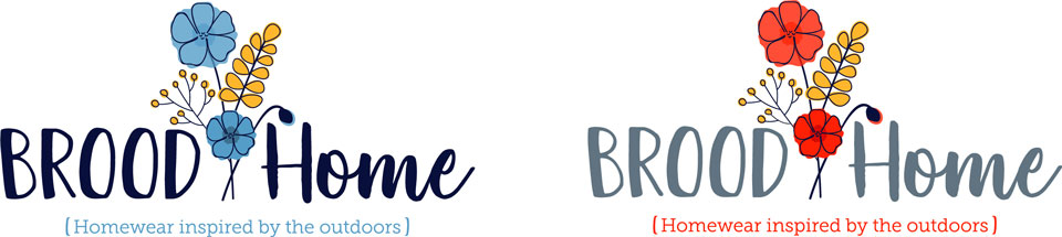
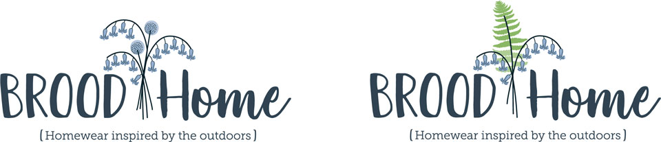
Brood Home
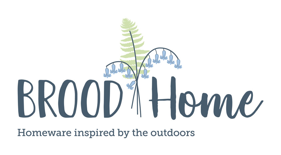
Brood loved the bunch of flowers for ‘Brood Home’ but wanted to try more classically English flowers, so we gave that a go in Stage 3…
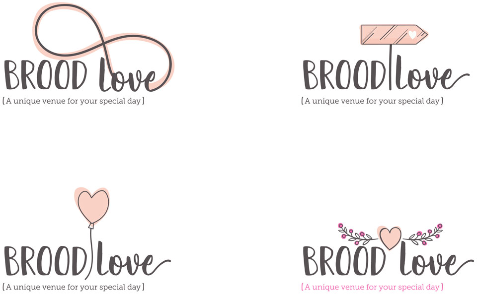
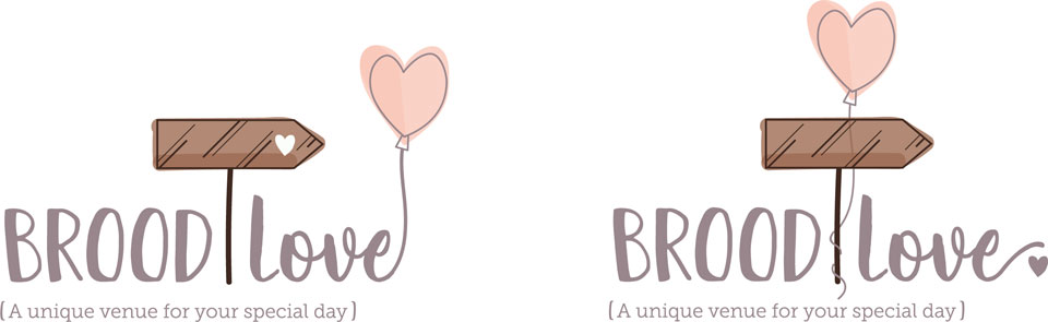
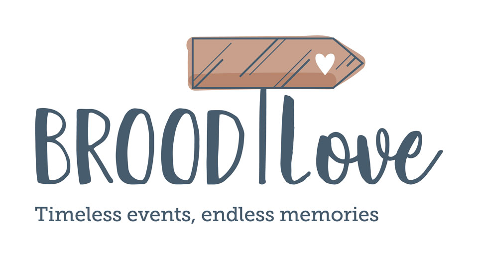
Brood Love
For ‘Brood Love’, they chose the sign and the balloon as their favourites so we tried to incorporate the two together. We also made the sign brown, rather than the blush it was in the second draft, to make it more rustic and traditional.
Brood Play
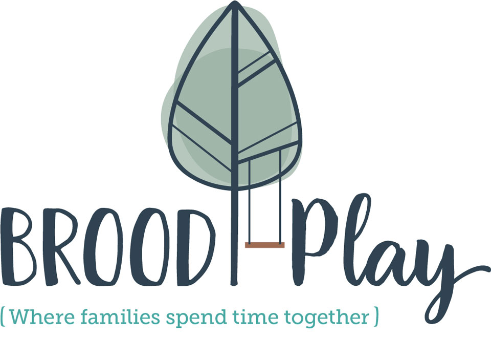
We had to do a bit more development on the ‘Brood Play’ logo as it needed to be versatile for all ages. We tried making the fire icon more mature in Stage 3…

Brood Group
During Stage 3 we also started the logo for ‘Group Group’ the brand which would cover all the Brood sub-brands. We took the feather which we had previously designed for ‘Brood Home’, which Brood had really liked from Stage 2.
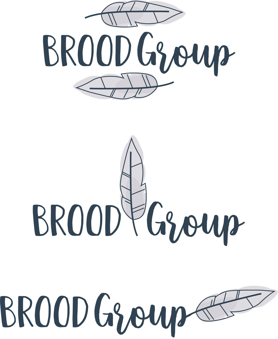
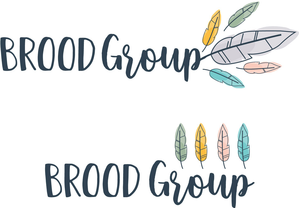
We also tried incorporating different coloured feathers into the Group logo which could represent the 4 sub-brands.
Stage 4
Brood Stay
The only change to ‘Brood Stay’ from stage 3 was moving the bird slightly and this logo was complete!
Brood Home
We went back to the drawing board on ‘Brood Home’, to try some alternative options for English flowers…
Brood Love
For ‘Brood Love’ we just removed the balloon and kept the logo simple with the sign post – And this one was complete!
Brood Play
The fire pit wasn’t really working for ‘Brood Play’ as it was giving the impression that it was just a forest school or camping – It needed to be more flexible to all outdoor adventure activities. There’s going to be ziplines and all sorts!
So, we tried taking the tree we had previously designed for ‘Brood Stay’ and including a swing…
Brood Group
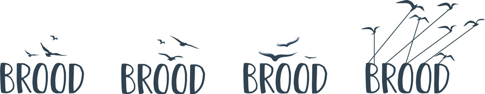
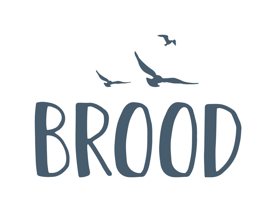
The main Brood logo also took a change of direction in stage 4, we decided to keep the logo really simple and work with the bird theme…
Stage 5
‘Brood Home’ and ‘Brood Group’ were both finalised after Stage 4…
Brood Play
After Stage 4, we stuck with the idea of the tree and swing, but the tree wasn’t quite right…
Brood wanted an Oak tree which was more suited to the Worcestershire countryside.
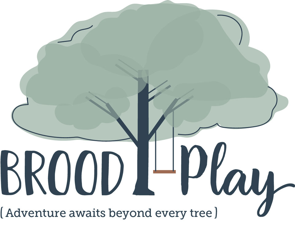
We tried a big Oak tree, making the canopy cover the words but it looked out of proportion when placed next to the other logos.

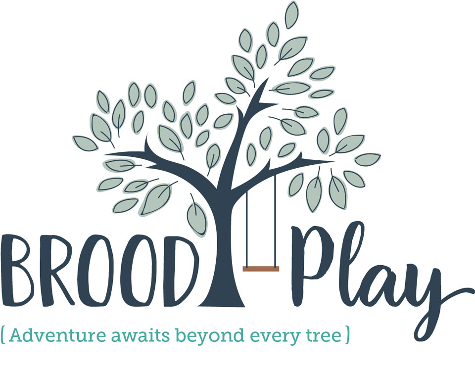
Stage 6
Now that the other logos were finalised, it was easier to look at them all together and make the final logo fit with the rest, which is when we finalised the design for ‘Brood Play’ in Stage 6…
Let’s talk colour schemes
We chose 3 shades of grey for the main Brood colour scheme, as we wanted this to be neutral and bring the colour in through the sub-brands.
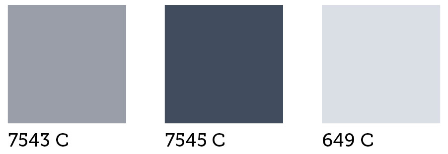
For the 4 sub-brands, we kept one consistent colour throughout all the colour schemes, Pantone 7545, this will tie them all together. We also then repeated the other greys from the main brand where it suited.
Not all the colours in the scheme are featured in the logos, which will make it really exciting when we start producing the print design for the brands and can start bringing more of the brand colours in.
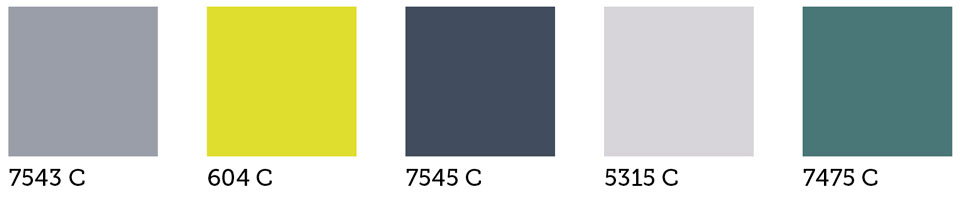
Brood Stay
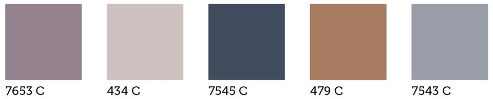
Brood Home
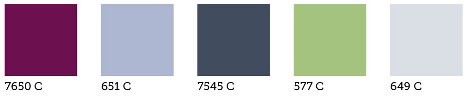
Brood Love
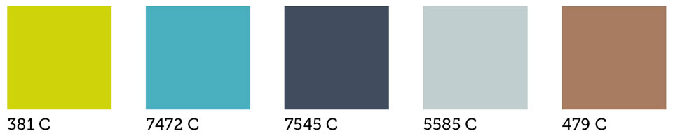
Brood Play
It’s been a great project and we have loved working with Natalie from Brood to bring together all our ideas.
We are excited to be continuing working with Brood over the next few months leading up to their relaunch in April 2019 – We are about to start working on a range of print design for their holiday cottages & glamping site and early next year we will be working on marketing material for ‘Brood Home’, ‘Brood Play’ and ‘Brood Love’.
If you want to keep up to date with life at Studio B61 follow us on Instagram. Hannah, Alec and Hannah T also have their own profile where you can see what they are working on. Follow @StudioB61_Hannah, @StudioB61_Alec & @StudioB61_Hann for updates.