
Creative rebrand for Brood and their 4 sub-brands
The Client
Brood is the new name for a local company specialising in homeware and hospitality. They are in the process of expanding their business into weddings and family adventure activity parks, and adding to their existing hospitality offering of countryside cottages, with a glamping site.
Brood + Studio B61
We met with Brood back in early August to discuss the rebrand and relaunch of their business ‘Brood’.
The Brief
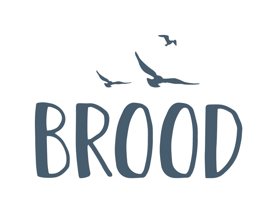
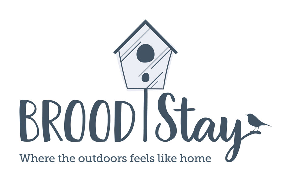
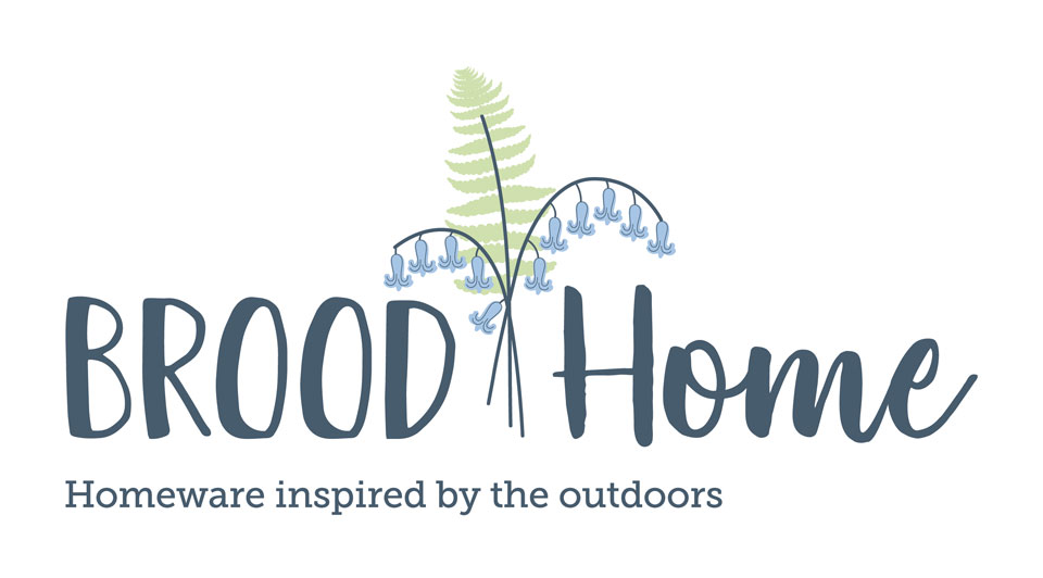
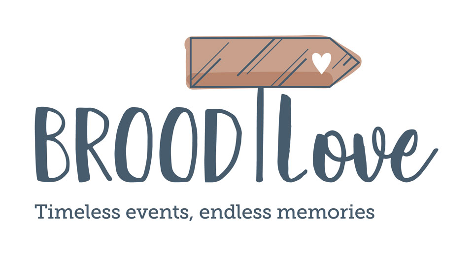
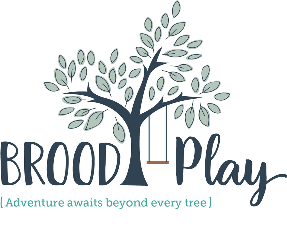
We were asked by Brood initially to create the logo for Brood Stay, Brood Home, Brood Play and Brood Love – 4 unique areas of their business. Once we began speaking with the client, we decided that they needed an umbrella brand to house the 4 sub-brands under, so we also created a logo for ‘Brood’.
Branding
Project Details
RESEARCH
Natalie from Brood created a great mood board for us before we began and a Pinterest board with logos they liked the look of. This gave us a really good starting point to establish the style they were after for the Brood branding.
It was clear from the moodboards that they were looking for a hand drawn, natural feel to the logo, nothing too modern or corporate. They wanted to incorporate feathers, birds, leaves and flowers… but nothing animated or “girly”. Hannah was going to need to draw lots of inspiration from the Worcestershire countryside on this one!
DEVELOPMENT
The branding project went through 6 stages of development before we decided on the final logos. The whole creative process flowed beautifully with feedback between the client and our Creative Director, Hannah.
You can follow the whole process in our blog post ‘Brood Flies The Nest’.
COLOUR SCHEME
We chose 3 shades of grey for the main Brood colour scheme, as we wanted this to be neutral and bring the colour in through the sub-brands.
For the 4 sub-brands, we kept one consistent colour throughout all the colour schemes, Pantone 7545, this will tie them all together. We also then repeated the other greys from the main brand where it suited.
Not all the colours in the scheme are featured in the logos, but will be brought in throughout the marketing material.
ICONS
Each of the 4 sub-brands has it’s own brand mark (or icon) to represent the area of the business. Each of these icons were hand draw (well freehand with a computer mouse) to create unique illustrations.