

This month we’ve hit the re-fresh button on several brands, we’ve re-designed old artwork and we’ve even taken a bit of time to relax…
Confetti Fields
At the start of the month Hannah and Charly took an afternoon off to go and explore Pershore’s beautiful confetti fields. They got some awesome shots of the flowers and enjoyed soaking up some of this never ending sunshine – Sometimes it’s essential to take a few hours out of the office to get creative.
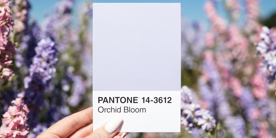
Check out the final shots & the behind the scenes ‘sneak peeks’ on our blog post ‘Throw Creativity Around Like Confetti’
Rebranding
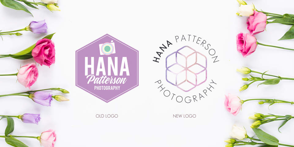
This month we had a chance to rebrand local photographer, Hana Patterson.
Check out our blog post ‘Lights, Camera… Branding’ which talks through the process of Hana’s rebrand from Pinterest moodboards to a final logo and colour scheme.
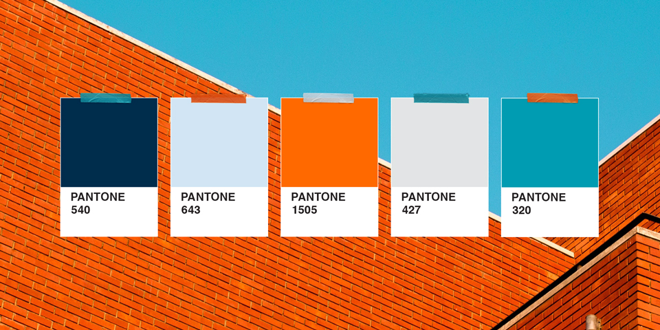
We have also been working on refreshing the branding for a local building solutions company, Connect Services.
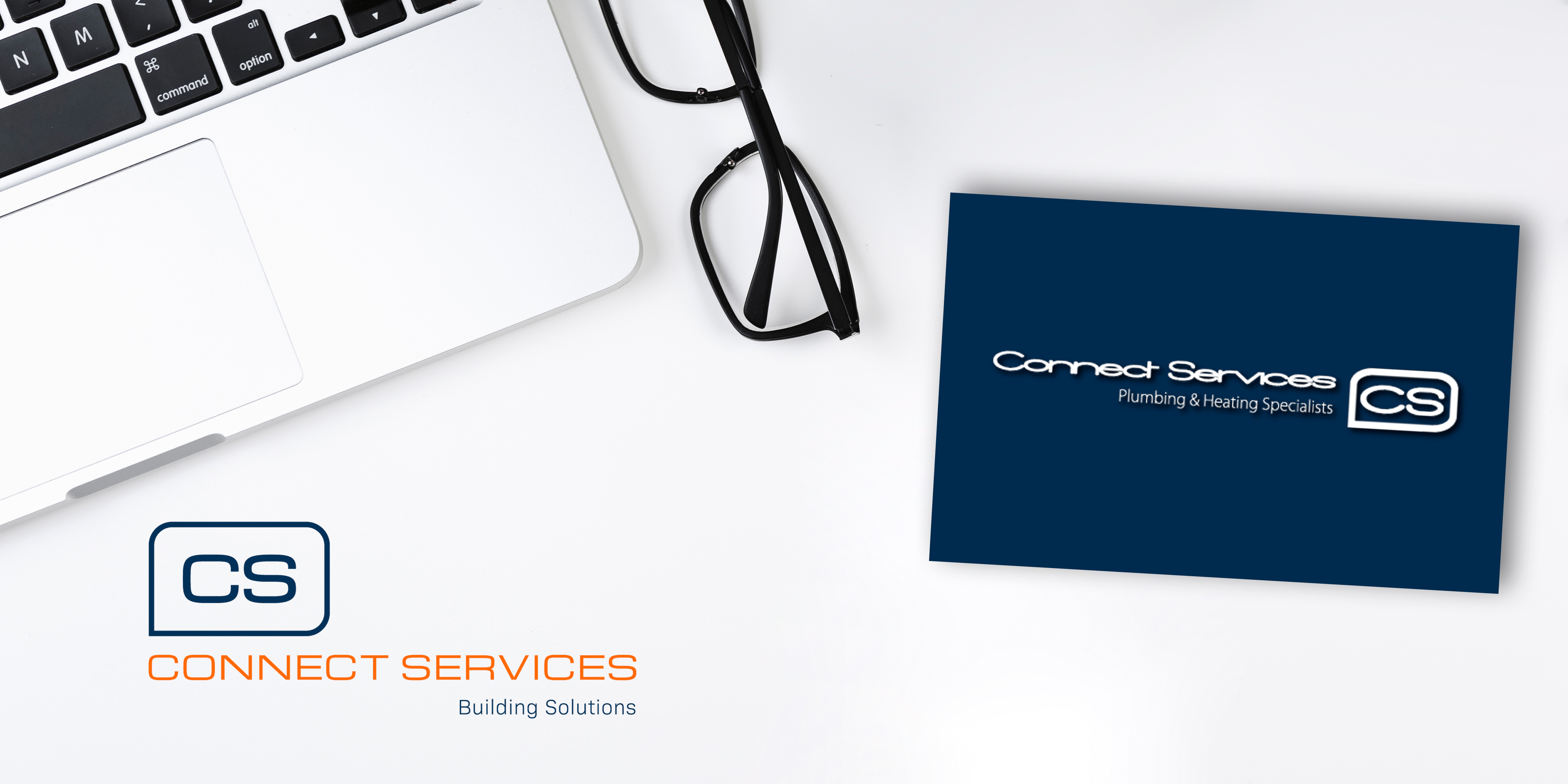
(Left: New logo. Right: Old logo)
Managing Director, Brad, approached us asking us to redesign his business stationery, business cards, letterheads & compliment slips. We may have convinced him that his logo needed a little a refresh too! His previous stationary lacked consistency as they were all designed by different designers over the years and it wasn’t helping to make a professional first impression.
We also created a brand new colour palette to go with the new logo to apply across all the assets. Previously Connect Services had only used dark blue and white, and although we love the dark blue, it needed a palette to work with it.
Hannah is a big fan of a ‘colour pop’ in a brand’s colour scheme “It helps when you are designing adverts or brochures for a brand, that you can create hierarchy with colour as well as size”
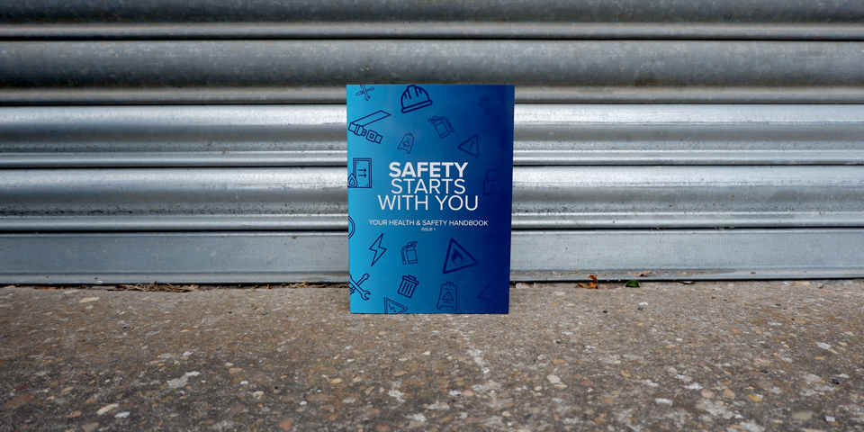
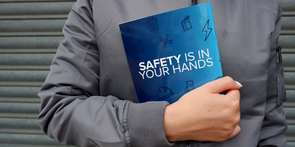
Charly’s first solo project
Charly completed her first solo project this month – A brand new Health and Safety booklet. The previous booklet was created in Microsoft Word, it had a messy layout and way too much clipart, which made it unprofessional and dated. Seeing as it’s a health & safety booklet, it’s important that it looks professional so that it is taken seriously.
We brought the whole booklet up to date by introducing a new layout and the brand assets we use across the rest of their design work. It now looks like a safety manual that means business. The Health and Safety team are really pleased with the final result… what do you think?
Outside the studio…
Work wasn’t the only thing on the agenda this month, Alec took some time out of his busy schedule this month to go on his annual biking trip to the Alps. This was the first trip out the country for his new GH5, and he had a lot of fun putting it to the test with high speed shots of the bikes whizzing down the mountains.
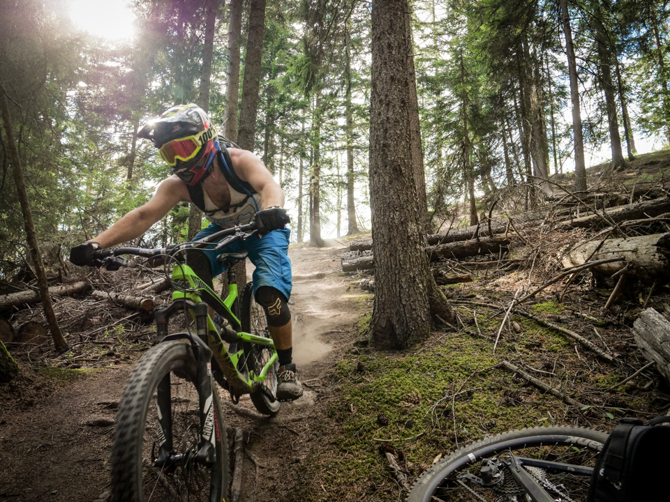
Check out more photos from his trip on our blog post ‘What goes up, must come down’
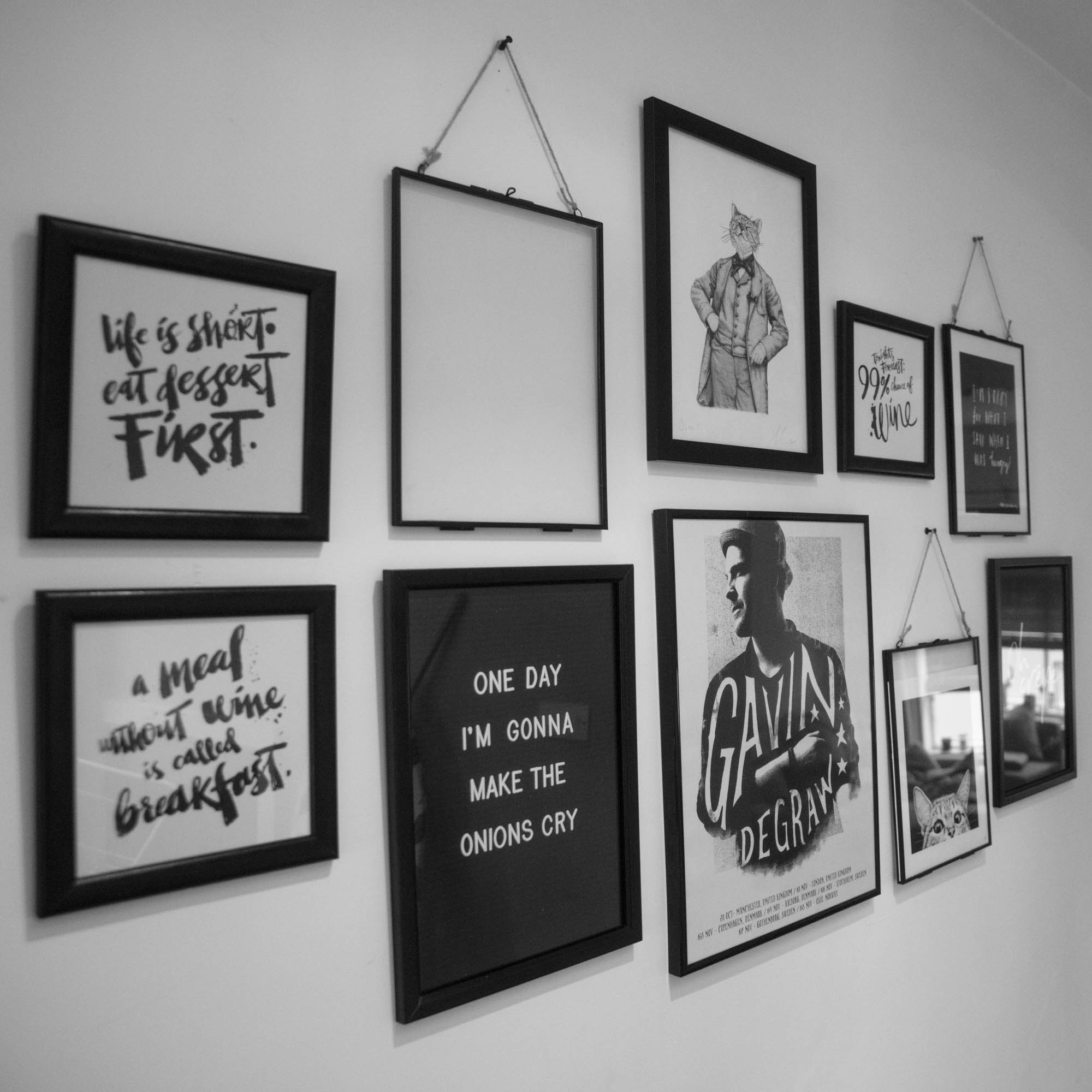
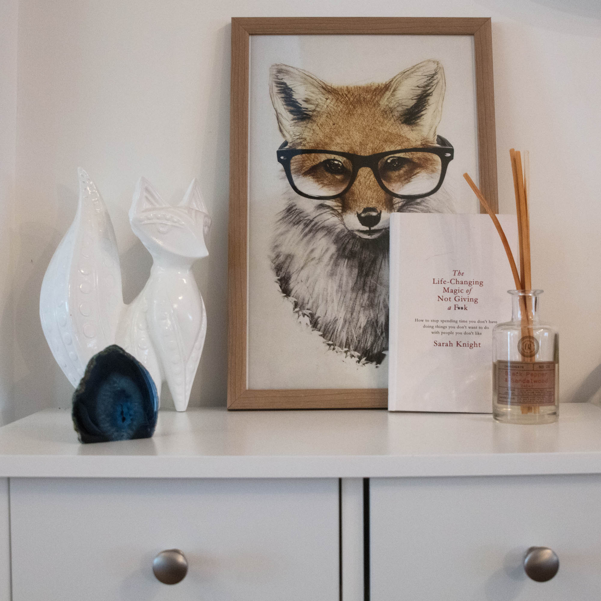
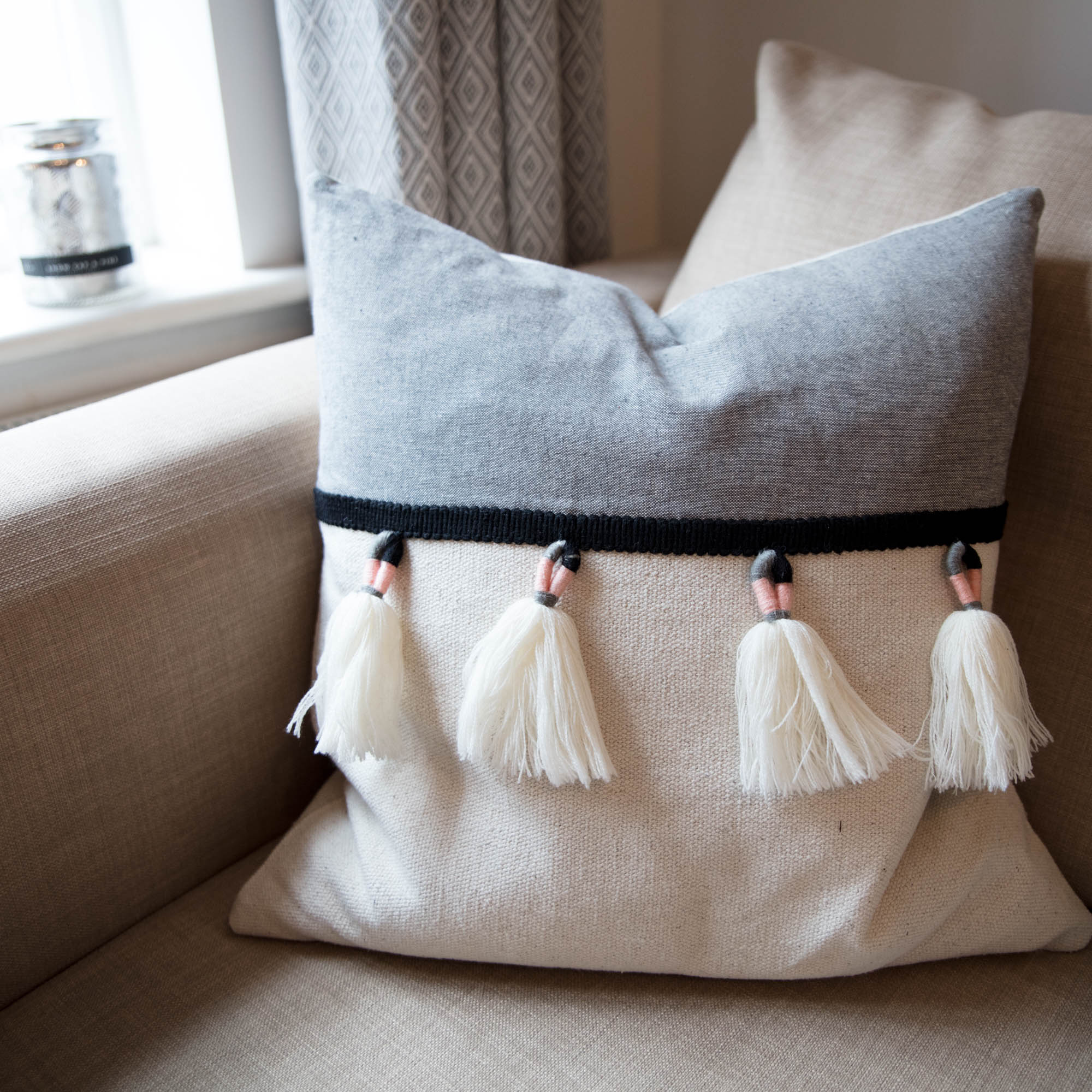
Hannah has also been on the move… she moved house in July back to her home town of Bewdley. Hannah’s been turning her designer eye to interiors and styling her home to have some real life #InstaGoals
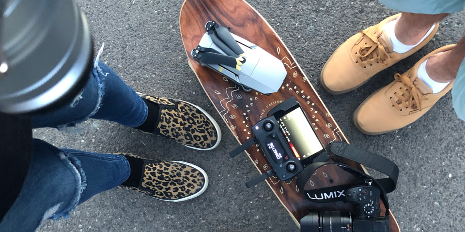
Now that Hannah & Alec are both back in Bewdley together, they’ve been out and about with their cameras and drones late into the evening… Make sure you follow their Instagram stories for behind the scenes!
If you want to keep up to date with life at Studio B61 follow us on Instagram. Hannah, Alec and Charly also have their own profile where you can see what they are working on. Follow @StudioB61_Hannah @StudioB61_Charly and @StudioB61_Alec for updates.