

When adding images to your content, you have two choices: Create your own or use stock images. Using original photography can set you apart and help build a stronger brand, but creating original images can be time-consuming and expensive.
Most companies rely on a mixture of both original images and stock images, which in my opinion is the best way to go for the average budget.
Stock images are renown for being cheesy (We can thank the meme generation for that). The key to using stock images is to find ones that fit your brand and dig a little deeper to find good quality images. Try to avoid cliched images as users can see through overused photos. They create a false perception of your brand and any message you are trying to get across.
So how do you avoid the cheese and find images right for your brand?
Choosing stock photos doesn’t have to be complicated, but it should require consideration of your brand. Take the time to think about the message you want to send and the photos that would suggest it. From there pick high-quality photos.
Spend a little
There are lots of websites out there that offer free stock images but there are several flaws to these:
- The resolution often isn’t high enough
- They are overused
- You may settle – They might not be the best photo for your brand, but you use them because they are free
The Search
Sifting through stock image websites can be an overwhelming experience. Like a google search, your keywords are important and narrowing down the search will help stop the need to look through pages and pages of results.
Tip: Shutterstock allows you to ‘exclude’ keywords which I find really useful.
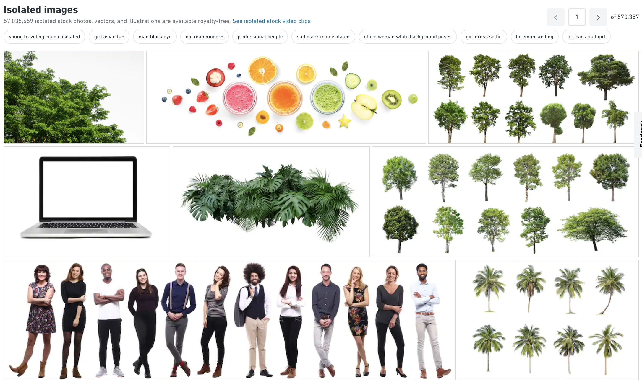
Recently I was searching for a house with a tree next to it, so I searched for ‘house’ + ‘tree’ (an obvious starting point) but kept getting treehouses. So instead I searched ‘home’ + ‘tree’ which brought up much more relevant photos, although still 1,028,081 of them. I then looked at my results and I was getting loads of photos of christmas trees. So I excluded ‘christmas’ from my search, which almost halved my results to 631,502. I then kept adding keywords and excluding keywords as I went through my search results, until I got a reasonable amount of pages to scroll through.
Tip: I often exclude the word ‘isolated’ from my search. An isolated photo is on a clean white background (of course if that is what you are looking for, go ahead and throw that into the search keywords).
Tip: If you’ve found an image you like, but it’s not quite right, look at ‘images by the same artist’ or ‘similar images’. I recently found the following image for a project, but I didn’t like the multiple planes and lines.
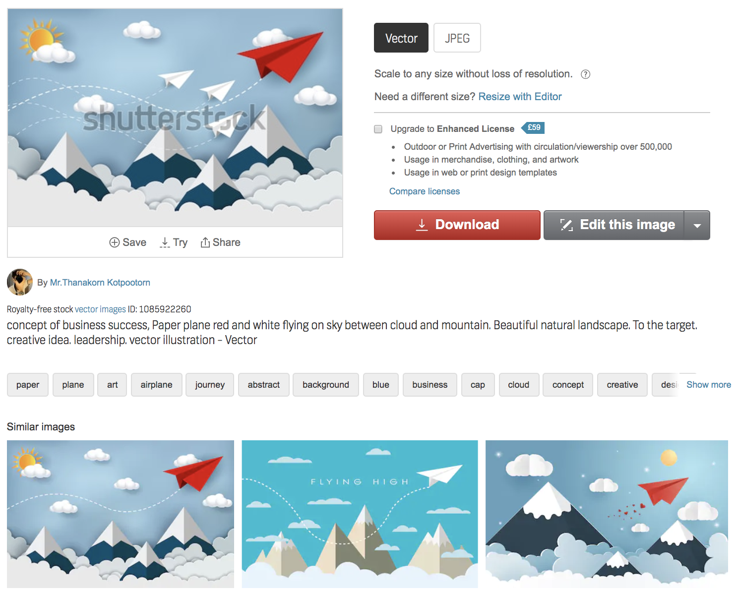
Oh, look what the first image in ‘similar images’ is… Thank you very much Shutterstock, that saves me a job of editing those out.
Mood Board
Most subscription sites allow you to create albums and add stock images to the album before purchasing them. This is the quickest and easiest way to narrow down your options. Go through your search results adding images to your album and then review those images before you choose. This is also a good way to make sure your images work together as you can see them in one place.
You’ll soon see a theme come together and that will help you to…
Make sure the images work together
A colour scheme helps with this. Your images should convey the same tone, whether that is consistency with your brand colours or within the series of images used. One of the filters on Shutterstock is ‘color’ (It’s an american website) which is very useful if you want images of a similar colour.
However, don’t let colour put you off – I’ll talk more about that later when I discuss personalising your stock images.
Test it out
Test the image in a design before you purchase it. If it’s for a website, try taking a screenshot of the site and mocking it up.
Remember:
Keep it relevant
Think about what the image is representing, the wording that is going with it and where it is going to be displayed. Find an image which helps explain the content but it doesn’t need to spell it out… readers are savvier than you may think.
Keep it current
Be careful with images that include tech and clothing. They can really date an image, so make sure you revisit your stock images over time and update them.
Keep it legal
Doing a quick Google search will help you find images but they are not always going to be legal. So go ahead and have a look on google for inspiration but then take that idea and search a reputable stock image site for something similar.
Don’t use a watermarked image (Yes, I have actually seen this on printed marketing – A stock image with the watermark on). The watermark can be easily removed by splashing out a few pounds. We aren’t breaking the bank here, we’re talking less than £10 for a legal image.
Research licensing agreements. If you’re trying to save money by using stock images, make sure that you are using them legally. You’re not saving money if you’re in violation of copyright infringement. A reputable stock image site will clearly state what their photos may be used for, some you can only use for certain purposes.
Buy Big
There are options on some sites to pay less for smaller images. I always recommend to clients to buy bigger than they need. It’s not much more for the maximum size image and I’ve had many occasions where clients have gone for a small image for their website, which is fine for that purpose and later on they’ve wanted to use it for a print campaign and it’s not high resolution. So unless you are 100% sure you aren’t going to need to print it or need it as a full page image on your website, Go Big.
What to consider when picking a photo with a person
Human photos have a positive impact on trustworthiness
Photos help people feel connected to the content and using photos of people or animals instantly creates a connection to the reader. Even if your company doesn’t deal with people, maybe you are in a finance or tech industry, an idea of people still makes it relatable.
Choose your people carefully
Think about your target audience, sites like Shutterstock and iStock let you filter your search by age, ethnicity and gender. There’s no point putting a smiley photo of a 20 year old on a campaign targeted towards over 40s.
Don’t over do it on the smiles
We like to think that all our employees are extremely happy to be at work every day but the obvious, looking at the camera with a big grin, can look fake and insincere. Instead, look for more candid images that communicate a genuine emotion.
Looking away from the camera vs looking at camera
A bit like the ‘fourth wall’ in film or television, it creates an imaginary barrier between the audience. It’s what separates the real world from the fictional world. Breaking the fourth wall is when the characters acknowledge they are in a movie and interact directly with the audience.
Photography can do this too. A person looking directly at the camera with a statement next to them – It really makes the reader believe that is what that person is saying or thinking. A more subtle image sets the scene and gives the idea without a direct correlation between the statement and the image.
Back of head vs face
In general, it’s best to use an actual person (employee or customer) rather than a generic person from a stock photo. However, sometimes it’s necessary to use stock, and in those situations if you don’t want your readers to question who that person is, don’t show their face.
Could the person in the stock image be someone that works there, without it being them?
Personally, I’ve been known to choose stock images to represent my business with people in that ‘could’ be me as they have a similar hairstyle and clothing to me. That way, I don’t need to go out and get a photo of me sat on a train or on a mountain.
 I’m not tricking people into believing it’s me, I haven’t labeled the image with ‘This is me on a train’, that might take it too far. The reader just doesn’t question it. If I put a man on there or a blond woman (I’m not blond) then the reader would instantly realise it wasn’t me and question who it was.
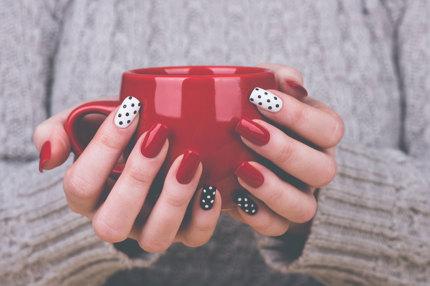
Pictures of arms, legs or bodies
I remember I did a blog post years ago about my life as a graphic designer and I used the following stock image at the top of the blog. Just a simple stock image showing hands holding a mug. The biggest comment I got was ‘wow, your nails’ and I let everyone think those were my beautifully manicured nails. It just shows you still need to think about your photo selection, even when it’s just hands in the shot.
Personalise it
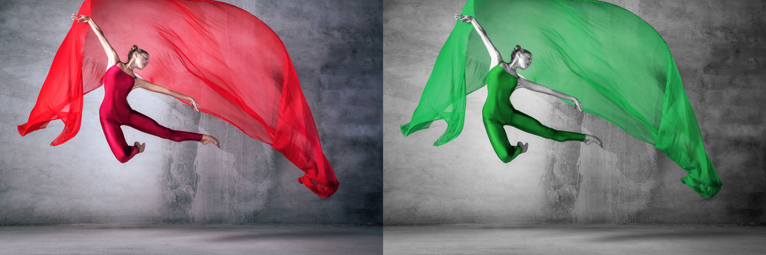
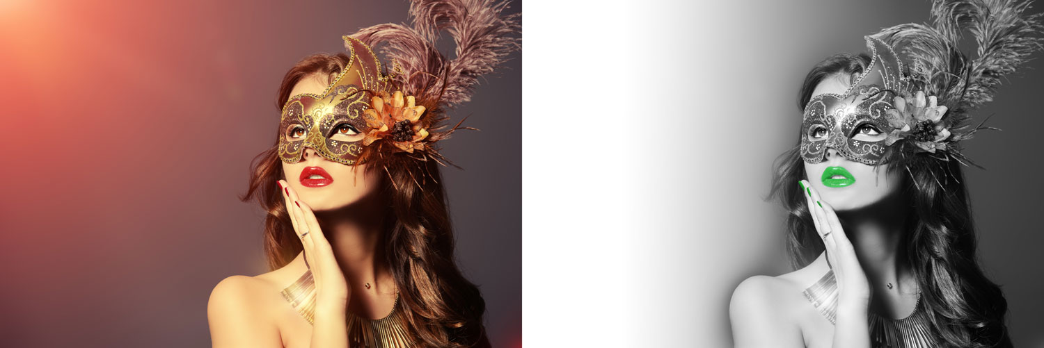
Make a stock image your own and personalise it – Just be wary of the license rules, sometimes you don’t have permission to change the image.
Personalisation can be as simple as changing the colour to match your brand colours. If you’ve found a stock image you like but it isn’t the right colour, it’s simple for a designer to change the colour to suit your brand, like the following images I did for Theataccounts.
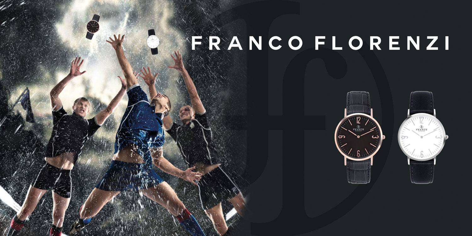
Think outside the box. How you can make it personal to you? I did an advertising campaign for watch brand, Franco Florenzi, to display at the Worcester Warriors rugby stadium. I could have left the stock image as it was – the tones and style fit the brand…
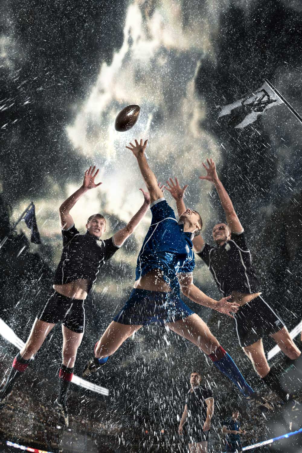
…But I didn’t leave it there, I removed the rugby ball and added their product photos in. Make stock images work for you.
Create it
When it comes to product marketing, in many cases original photos are a must because consumers what to see images of the products they’re buying. Stock images can be misleading and that’s when you have to create your own.
I recently worked on a project with Shire to source stock images to populate their new website. One of the images they needed couldn’t be done with stock images though as it featured a product they manufacture. They sent us the following image they had found on Shutterstock, which they wanted to use as inspiration to create their own image with their products.

I went out to their yard and took the following photos.


Commit to a photo
There are thousands of photos out there and you only need one. If you’re on page 50+ of Shutterstock, call it a day. You’re photo is important but it shouldn’t take hours to find the one that matches your content. If you are still struggling, give us a call. We can help you with your search.
If you want to keep up to date with life at Studio B61 follow us on Instagram. Hannah, Alec and Hannah T also have their own profile where you can see what they are working on. Follow @StudioB61_Hannah, @StudioB61_Alec & @StudioB61_Hann for updates.